Landing Page Design: What Separates Pages That Convert From Pages That Don't
A good landing page design doesn't just look clean — it removes every obstacle between a visitor and a yes. Here's what actually makes pages convert.
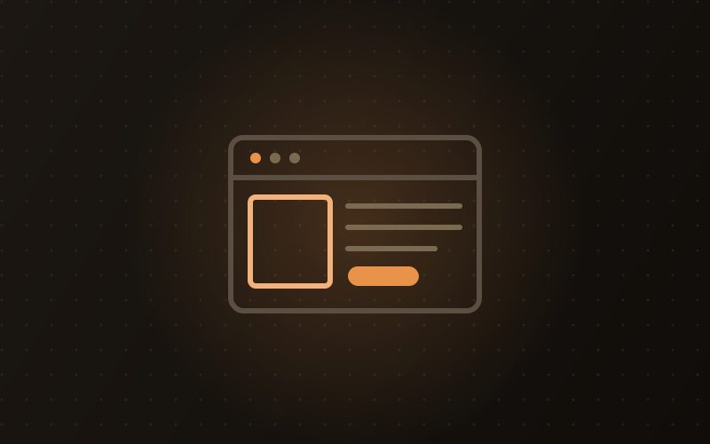
Landing page design is one of those things that looks simple until you see the data. You've run the campaign, traffic is flowing, but nobody's converting — and the first instinct is to blame the ads, the audience, or the pricing. Nine times out of ten, the page itself is what's broken. A landing page is doing a very specific job: taking someone who just clicked on something and moving them one step closer to a decision. Every design element either helps that happen or gets in the way, and the difference between a 2% and an 8% conversion rate often comes down to a handful of choices that the right designer would have made differently from the start.
What Makes a Landing Page Different From a Regular Website Page
A landing page has a single declared purpose — get someone to book a call, start a trial, buy a product, or sign up for something. That's fundamentally different from your homepage, which is built to help multiple types of visitors with multiple goals find their way around. Your homepage is a hub. A landing page is a corridor with one exit.
That distinction has real design consequences. On your main website, a navigation bar with eight links is useful — it's how visitors find what they came for. On a landing page, that same navigation bar is a distraction. It gives someone who nearly converted a route to the 'About' page instead of to the form. Good landing page design removes almost every choice that isn't the one choice you're asking the visitor to make.
This also means a landing page isn't the right place to tell your complete brand story. The visitor arrived with specific intent — usually from a Google Ad, a social campaign, or an email — and the page needs to match that intent closely. When there's a gap between what the ad promised and what the page delivers, that's called message mismatch. It's one of the fastest ways to lose someone who was genuinely ready to convert.
The Anatomy of a Landing Page Design That Actually Converts
Every high-converting landing page shares the same structural DNA. These aren't aesthetic preferences — they're the result of decades of testing across thousands of pages and conversion events. When you work with professional website designing services, this structure is where the conversation should start, not end.
- Above-the-fold headline: the first thing someone reads, and it needs to communicate the specific value — not your company name, not a tagline, but the concrete outcome the visitor gets. 'Get 3x more leads from your website' beats 'Digital Marketing Experts Since 2015' on a campaign page every single time.
- A supporting subheadline: one or two sentences that add context to the headline — who this is for, what the process looks like, or the key proof point that addresses the biggest doubt someone might have before reading further.
- Hero visual: a product screenshot, a short explainer video, or an image showing the outcome rather than the process. People respond to seeing what they'll get, not reading descriptions of how it works.
- A single, prominent CTA button: one ask, one label, one color that stands out from the rest of the page. 'Start your free trial' beats 'Click here' because it tells the visitor exactly what they're agreeing to. Place it above the fold and repeat it at the bottom of any page taller than a single screen.
- A short form when you need contact details: every additional field drops form completions by roughly 10 to 15 percent. Ask for the minimum required to move the lead forward — name, email, and phone is almost always enough for a first step.
- Specific social proof: two or three testimonials that mention real, concrete outcomes rather than generic praise. 'We got 40 qualified leads in the first month' moves people. 'Great team, highly professional' moves almost no one.
- Trust signals near the conversion point: a privacy policy link, security badges for checkout pages, recognisable client logos, or real contact details. Small individually, but they collectively lower the anxiety of submitting — especially for first-time visitors.
Why Most Landing Pages Fail (And What to Actually Fix)
Most landing pages don't fail because they look bad. They fail because they're asking the visitor to do too much work, or they're trying to accomplish three different things at once. These are the patterns that come up again and again:
- Headlines that describe the company instead of the outcome for the visitor. If your headline could belong to any competitor in your category, rewrite it around the specific result you deliver.
- Too many CTAs competing for attention. 'Book a demo', 'Download the guide', 'View pricing', and 'Contact us' all on the same page creates decision paralysis. Pick one primary action and demote everything else to a secondary role — or remove it entirely.
- Slow load times that kill intent before it can act. If a page takes more than three seconds to load on mobile, a significant share of visitors leave without reading a single word. Website speed directly affects your conversions in ways most businesses don't measure until they've already lost the revenue.
- Body copy that reads like a brochure. Landing page writing should sound like a direct conversation with someone who has a specific problem you can solve — not a press release about how innovative your methodology is.
- A design built for a desktop screen and then 'made responsive' as an afterthought. Mobile visitors — which is the majority of your traffic in most categories — get a degraded experience, and degraded experiences convert poorly.
- No testing, ever. A landing page written once and never changed is leaving conversions on the table. Even small changes — headline wording, button color, image choice — can move conversion rates measurably. You can't know what works until you actually test it.
UI UX Design Principles That Landing Pages Can't Ignore
UI UX design — user interface design (how a page looks) combined with user experience design (how easy it is to use) — becomes especially critical on landing pages because visitors are making a snap judgment. They decide within a few seconds whether what they're seeing is credible and worth engaging with. The visual design either supports that judgment or undermines it.
Visual hierarchy is the backbone. On a well-designed landing page, your eye flows naturally from the headline to the subhead to the hero image to the CTA without any conscious effort. That flow is the result of deliberate choices about font size, weight, color contrast, and spatial arrangement. When everything on a page is given equal visual emphasis, nothing stands out, and a visitor's attention has nowhere to go.
White space — the empty area around design elements — has a direct impact on how credible and premium a page feels. A page packed edge-to-edge with text and images reads as low-quality even when the individual elements are fine. Space signals confidence: what's here is worth reading, and there's no need to crowd everything in.
Cognitive load is easy to underestimate. Every element on a page that isn't directly contributing to the conversion decision adds mental overhead — the effort the visitor has to spend processing what they're seeing. The goal is to reduce that load as close to zero as possible. Not because visitors aren't capable of handling complexity, but because they have no obligation to spend effort on your page. The moment it feels like work, they leave.
Responsive Website Design and the Mobile Landing Page Problem
In India, somewhere between 70 and 80 percent of web traffic for most business categories arrives from smartphones, not desktops. Which means if your landing page was designed primarily for a desktop browser and then 'made responsive' as a second step, you've built the wrong way around.
Responsive website design — where a layout automatically adjusts to fit the screen it's being viewed on — is the baseline expectation, not the goal. The goal is a page designed with mobile behavior as the primary experience, and the desktop version adapting from that. In practice, a mobile-first landing page has shorter and punchier headlines, less text above the fold, a CTA positioned where a thumb naturally rests, and a form short enough that filling it out on a phone doesn't feel like punishment.
The business case is worth understanding clearly. A fast, well-designed, mobile-first landing page doesn't just convert better — it earns higher Quality Scores in Google Ads, which directly lowers your cost per click. Poor landing page experience is one of the explicit signals Google uses to determine how much you pay per click. That makes page quality not just a conversion problem but a media efficiency problem, and it's why technical SEO and page performance end up being the same conversation for most businesses running paid campaigns.
Custom Website Design vs. Template Landing Pages: When Each Makes Sense
Not every landing page needs a custom build. Tools like Webflow, Unbounce, and similar platforms let you put together a functional page in a day or two, and for a campaign you're testing on a small budget, that's a completely reasonable approach. The limitations surface when the page needs to fit seamlessly inside an existing brand system, when you need backend integrations that template tools don't support, when page speed is genuinely critical, or when a difference of a percent or two in conversion rate has meaningful revenue impact at your traffic volumes.
Custom website design gives you full control over technical performance, Core Web Vitals (Google's set of speed and usability benchmarks that affect both organic rankings and paid ad Quality Scores), and every aspect of the visual language on the page. It takes longer and costs more upfront, but for any page driving significant paid traffic, the economics typically work quickly. If you're working with a website development company on your main site anyway, adding landing pages to the same project usually costs a fraction of what a standalone build would.
What to Tell Your Design Team Before the Work Starts
A useful landing page brief answers five questions before any design software opens. Who is this page for — specifically, not your full audience? What is the single action you want them to take? What are the two or three things that usually stop this person from saying yes — the hesitations, doubts, or comparisons they typically make? What proof do you have that speaks directly to those doubts? And where is this traffic coming from, because a page built for warm email subscribers behaves very differently from one that needs to earn trust from cold paid search traffic.
These questions aren't a formality. The answers shape the entire layout: how much context-setting the page needs to do, how many trust elements to include, whether a long or short page makes sense, and what the headline hierarchy should look like. A page for someone who clicked a retargeting ad already knows your brand and needs very little explanation. A page for someone who found you via a generic Google search needs to earn trust from scratch. Treating both visitors the same is one of the most common and quietly expensive mistakes in conversion design.
How long should a landing page be?
It depends on the complexity of the decision you're asking someone to make. A page asking for a free trial signup can be short — headline, a few benefit points, and a form. A page selling a high-value service needs to do more work: address objections, show proof, explain the process, and build enough trust to justify a commitment. The rule isn't shorter or longer — it's that every section should be earning its place. If a section doesn't move the visitor closer to the decision, cut it.
Should a landing page have a navigation menu?
Usually not. Navigation gives visitors routes away from the page — to your blog, your team, your other services — and removing it consistently improves conversions for campaign-specific pages. The one exception is a highly research-oriented audience that needs to do more investigation before committing, in which case a simple link to a case study or pricing page can help rather than hurt. For most dedicated campaign pages, though, the default should be no navigation at all.
What is a good conversion rate for a landing page?
Conversion rates vary significantly by industry, offer type, and traffic source. For a lead generation page targeting warm traffic, 10 to 20 percent is achievable. For cold paid traffic converting to a free download or consultation request, 3 to 8 percent is a realistic target. The more useful comparison is always your current rate versus what you achieve after improving the page — the absolute number matters less than the direction you're moving and whether you're testing consistently.
How much does landing page design cost in India?
A professionally designed custom landing page from a capable studio typically runs between ₹20,000 and ₹80,000 depending on complexity, integrations required, and whether copywriting is included. Template-based builds using tools like Webflow or Unbounce cost less — sometimes under ₹10,000 — but come with limitations on custom functionality and long-term flexibility. For any page driving meaningful paid traffic, the cost of a well-designed custom page is usually recovered within the first month through improved conversion rates.
Do I need a separate landing page for each ad campaign?
For any serious campaign, yes. Message match — the alignment between what your ad promises and what the landing page delivers — is one of the biggest conversion levers available. If you're running three campaigns targeting different audience segments or promoting different offers, sending all of them to the same generic page means at least two of the three will feel slightly off to those visitors. Dedicated pages for each major campaign take more effort upfront but typically deliver conversion improvements that justify the investment quickly.
Landing page design is where traffic investments either compound or drain away, and the gap between a page that works and one that doesn't usually traces back to specific decisions made early — the brief, the structure, the hierarchy. If you're planning a campaign and want a page built to actually perform rather than just look the part, our web design team handles exactly this kind of work. Get in touch and we can talk through what your page needs to do.